

Websites rarely fail because a designer picked the wrong blue.
They fail because nobody decided what the page was for, so every element argues for equal attention, and the visitor resolves the argument by leaving.
Impactful website design is mostly the discipline of deciding what matters most on each page, then making everything else defer to it. The six factors below are the tools for that. They are not a checklist to complete in order; they are a hierarchy, and the earlier ones constrain the later ones.
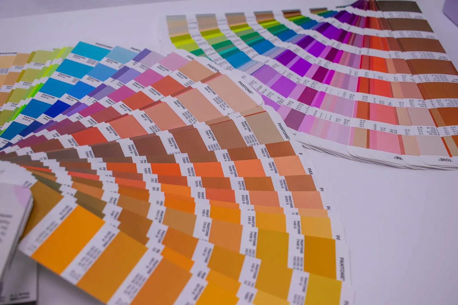
1. a colour system, not a colour scheme
A scheme is a set of colours you like. A system assigns each one a job.
Decide what your primary action looks like, what a warning looks like, what a link looks like, and then use those consistently everywhere. The moment two different things share a colour, the colour stops carrying information.
Check contrast as you go rather than at the end. WCAG 2.1 Level AA asks for 4.5:1 on body text and 3:1 on large text and interface components. Brand palettes frequently fail this, and it is far cheaper to discover that during the palette decision than after the site is built.
Never let colour carry meaning alone. Pair it with an icon, a label or a position change, because a significant number of readers will not distinguish your two shades of green.
2. Space as a structural tool
White space is not space. It is the mechanism that tells someone which things belong together.
Elements that sit close read as related. Elements separated by generous space read as distinct. Get this wrong, and no amount of typography will rescue the hierarchy, because proximity beats size in how people group things.
The practical version: increase the space between sections more than you think necessary, and reduce the space between a heading and the text it introduces. Most cluttered pages have this the other way around.
3. Calls to action that name the outcome
A button labelled “Submit” tells the reader what the form does for you. A button labelled “Send my enquiry” tells them what happens to them.
One primary action per page. If everything is a button, nothing is the next step, and the visitor has to make a decision you should have made for them.
Put the action where the decision gets made rather than only at the bottom. Someone convinced by the third paragraph should not have to scroll past four more to act.
4. Images that earn their weight
Every image is a download before it is a design decision. Size them for the dimensions they actually display at, serve modern formats, and load below-the-fold images only when needed.
Stock photos of people pointing at laptops add weight but don’t communicate much. A photograph of your actual team, premises, or work does both jobs at once.
This is where visual and performance goals meet rather than compete. Reducing unnecessary data transfer and processing supports a faster experience while lowering estimated digital carbon, though environmental figures remain modelled rather than directly measured.
5. Navigation that matches how people think
Label things the way visitors describe them, not the way your organisation is structured. “Services” beats “What we do” for scanning; both beat an internal department name.
Keep the primary navigation short. If it needs more than about seven items, the problem is usually content organisation rather than menu design.
Test it on someone who does not work for you. Ask them to find your pricing, or your contact details, or the thing you most want people to find. Hesitation is data.
6. Responsive performance, not just responsive layout
A layout that reflows on a phone is the minimum. What matters more is whether it loads on a phone, on a mediocre connection, in daylight.
Test on a real mid-range device rather than a desktop browser window made narrow. Check Core Web Vitals on your most-visited pages under stated conditions, so you know whether the design is performing or merely rendering.
Our sustainable web design work treats these six as one brief rather than a sequence of separate improvements.
